Mirror Apparel e-Commerce Site
Overview
A case study for Mirror, a fictional apparel brand. Working in collaboration with Designlab, the goal was to create a high fidelity prototype, and rebranding the company’s identity.
Research Goals
• Design a responsive e-commerce website that is easy to use and that allows customers to browse through all products and filter by size, color, style and others.
• Visually rebrand the company so that is modern and neutral to appeal to a wide range of people and styles.
Research Process
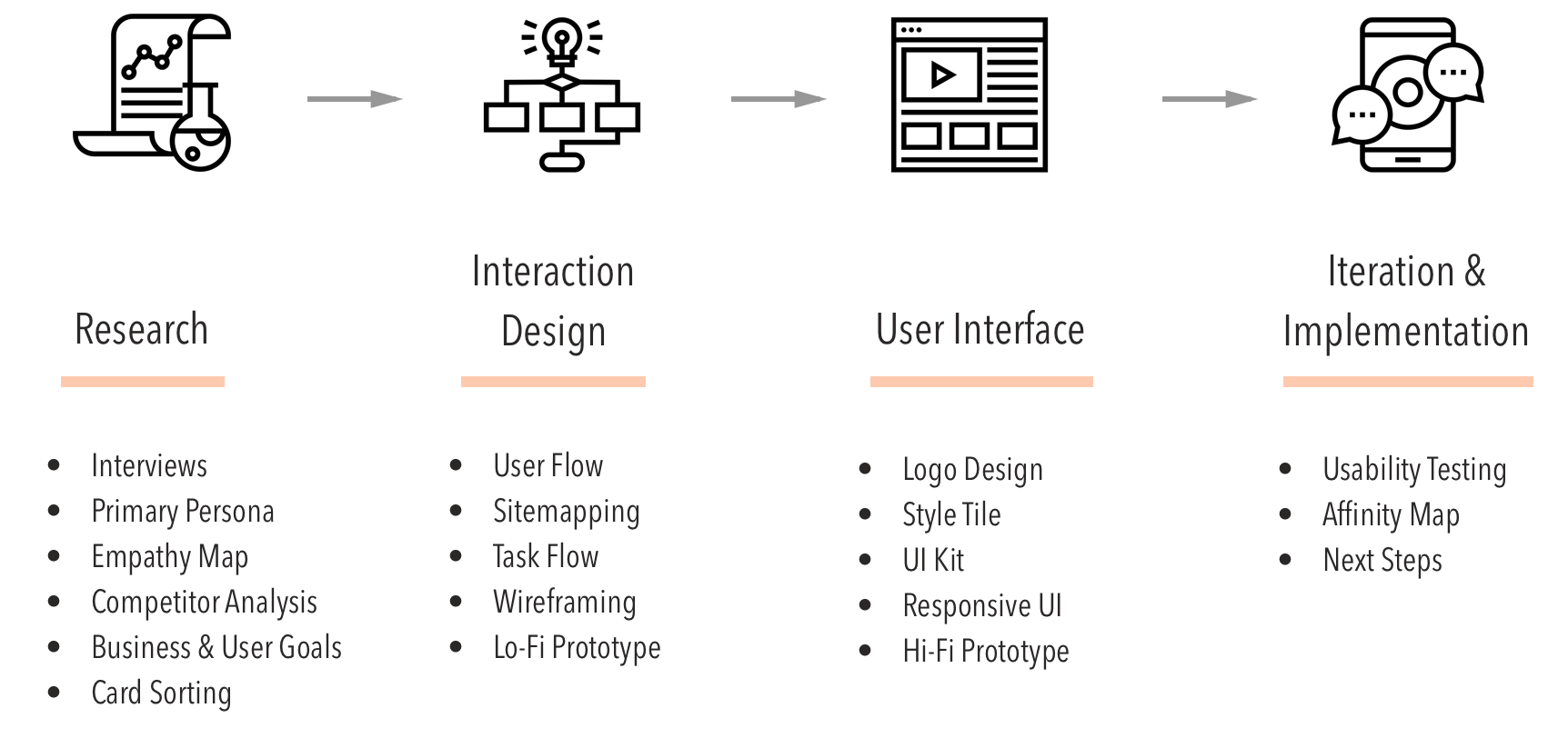
Research
Interviews
Contextual inquiry will be conducted among a group of participants about their online shopping experiences with clothing companies.
Some key questions:
• What attracts users to shop at certain websites? And how?
• What are the user’s needs?
• How are the user’s experiences from shopping online?

Empathy Map

Using notes taken from the interviews, an empathy map is built by categorizing points from the interview into what the users are saying, thinking, feeling and doing. From this map, user insights can be drawn, which leads todefining the user’s needs. This is also where we start establishing a persona to help guide the process.

Primary Persona
Drawing from the data of the interviews and empathy map, a primary persona is created to help guide the research and design with a specific user in mind.
Competitive Analysis
The e-commerce websites from five different online apparel retailers with similar niche markets were compared. By studying competitor’s e-commerce website, we were able gather information about features every site had in common, and which features that were works best for the user.

Business and User Goals
Goals from both business and user are analyzed and compared, and also to find common goals that would meet the needs of both. By defining these goals, we were able to design more objectively and prioritize features for the website.
Card Sorting
Five participants were asked to sort 50 clothing items into categories as they see fit by using Trello as a live card sorting tool. How a user categorizes the items helped define a pattern of information architecture that will help with mapping how the website’s products.

Interaction Design
User Flow
A user flow map is created to analyze all the possible interactions the user may have with the website, as well as how they landed on the website. By mapping the user flow, we are better informed on how to design the navigation for the website.

Site Mapping
A sitemap helps determine the structure of the website’s content, and establish navigational patterns that would be useful for the website’s user interface.
Task Flow
A task flow map is created to analyze a persona’s interaction with the website, and how they would navigate the site to perform a specific task. This task will also serve as a prototype reference when building the wireframes.
Wireframe Sketches
Some preliminary sketches to determine the layout of the website wireframes. During this stage many ideas, both good and bad, are explored. This helps determine a general layout before proceeding to low fidelity prototyping.

Responsive Wireframes
By thinking ahead of how the layouts would work on different devices, this helps with the prototyping process by tackling some key interaction issues early on.

Low Fidelity Prototype
A lo-fi prototype is created using Invision, with a task flow of finding a product, adding to shopping bag and checkout. The main goal of this lo-fi wireframe is to determine the usability of the information architecture, and to fix any frictions or pain points before investing time and effort into the UI.

User Interface Design
Logo Design
A logo helps establish an identity with the user’s interaction with the site. Using adjectives that describe the brand best helps determine the right fit for a logo.

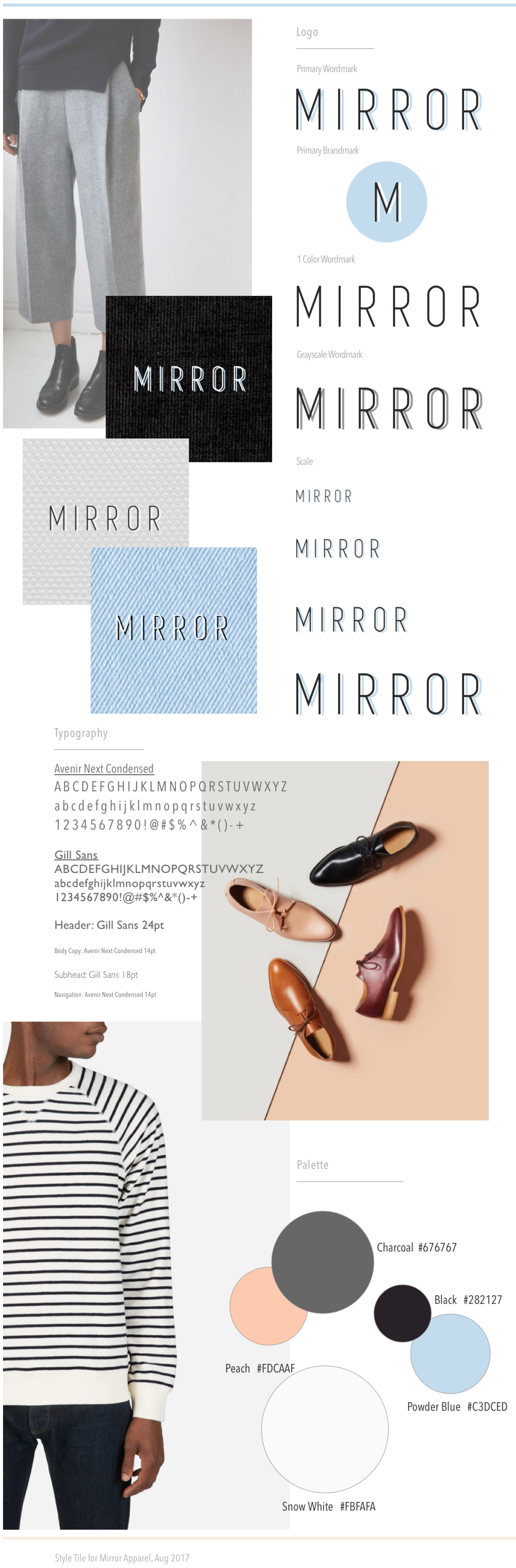
Style Tile
A style tile further establishes the interface’s identity to the user. Having a style tile is helpful when designing UI elements for the high fidelity prototype. It keeps the design grounded with the ‘mood’ of the style tile. The average attention span a website user spends time on a site is seven seconds, so it is important that the user can immediately ‘feel’ what the brand and website is about.
UI Kit
A UI kit determines the website’s elements and style to match the brand’s identity and also establish a consistent interface experience for the user. This kit is also useful for exporting assets for spec tools for thedevelopment stage later.

Responsive UI Design
How the UI design adapts to different devices can be explored with responsive UI mockups. With this exercise, it is more effective to spot design problems that arise early on and solve them.

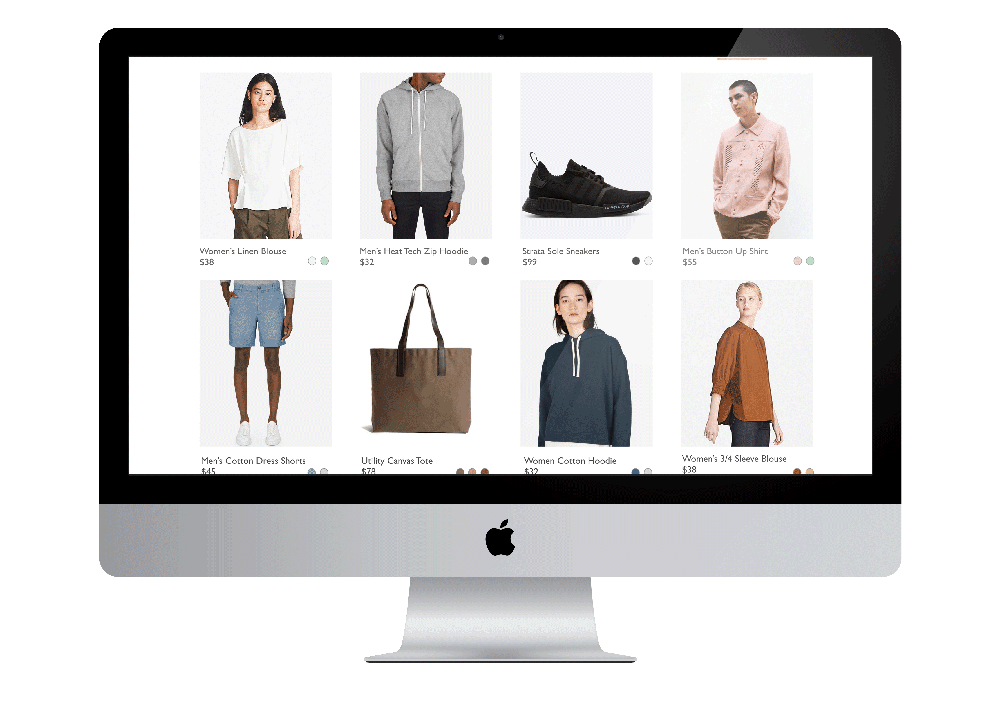
High Fidelity Prototype
A high fidelity prototype is expanded upon the low fidelity wireframe, using the task flow and UI Kit as references. With Invision app, the wireframes are converted into a working prototype with the bare functionality for user testing.
User Task: To purchase a women's blue button up blouse, and checkout with the item.

Iteration & Implementation
Usability Testing
Once the working prototype was ready, we gathered participants to test the prototype. Only providing a general description of the task flow and the limited functions of the site, we left the users on their own to navigate the site and perform the task mentioned beforehand.
Test Objectives
• To determine the effectiveness of user flow for finding a product, adding to bag, and checkout.
• Also determine any pain points or friction to the task flow
• To gather users’ impressions in regards tothe usability and quality of the website

Affinity Map
An affinity map is created from the usability test notes, by categorizing the information into groups. Once the info is organized, it helps us gain insight into what could be improved with UI and determine the next steps of the case study.
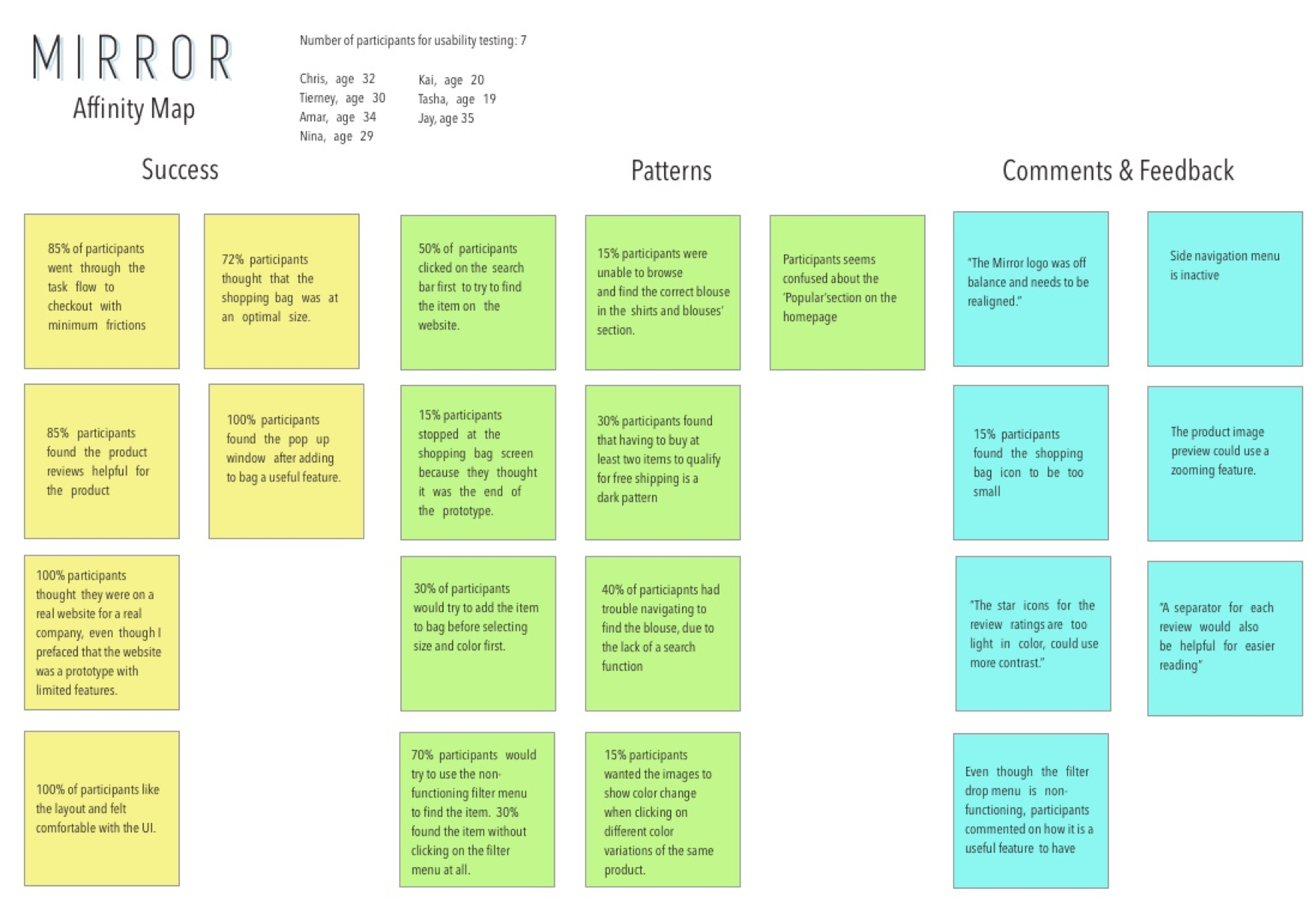
Next Steps
At this stage of the case study, our findings are compiled and presented to the stakeholders. Using theinsights gained from the user testing, the next possible steps are discussed between the design team and the stakeholders.

What I Learned
From this case study, I was able to further improve on my interviewing skills, by listening empathetically and avoid asking leading questions. Although it was not hard to determine which features and design patterns work best for a e-commerce site, there were some questionable design decisions found within the competitors’ sites. Putting together usability tests was a great way to learn how to gain useful data. The best moments happen when an assumption is disproven, and suddenly there were more questions to ask, which led to more to learn about the user experience.