
Google Aria
Google Aria: Mobile App for Wearable Technology
Research & Discovery | Synthesis & Defining | Interaction Design | Testing | Visual Design | Next Steps
Overview
Google Aria, a fictional product for a real world problem, built around the idea of an everyday health app, with a focus on users who are dealing with memory loss, or early-stage dementia. The app is designed to work in tandem with wearable technology and to help the user facilitate memory, reduce risks and promote autonomy in users' lives.
In my design process for this app, I dived into the everyday experiences of people who either dealt with memory loss personally, or witnessed it as a caretaker. The goal of the research was to determine how a health app might best help an individual with Alzheimer's, early dementia or memory loss.
Design Goals
• Design a mobile application that can help users with memory loss, improve their memory, reduce risks and promote autonomy in the lives.
• The app should be in line with Material Design and other Google apps.
• Design a logo for Google Aria that is also in line with the Google family.
Project Details
Challenge | To discover the experience of users with memory loss problems and to design an app that is useful for improving their lifestyle.
Client | Google Aria
Role | Lead Designer: Design Researcher, IxDesigner, Visual Designer
Duration | 2 weeks
User task: Rick needs to create an account, connect his daughter Anna as a proxy and set a reminder to pickup his prescriptions later.
What is Google Aria?
Estimates vary, but experts suggest that more than 5 million Americans have Alzheimer’s disease. Unless the disease can be effectively treated or prevented, the number of people with it will increase with population growth. That’s because the risk of Alzheimer’s increases with age, and the U.S. population is aging. Google wants to explore how we can create a wearable companion app that helps with the early stages of memory loss and keeps the user informed and updated at all times while helping them improve their memory.
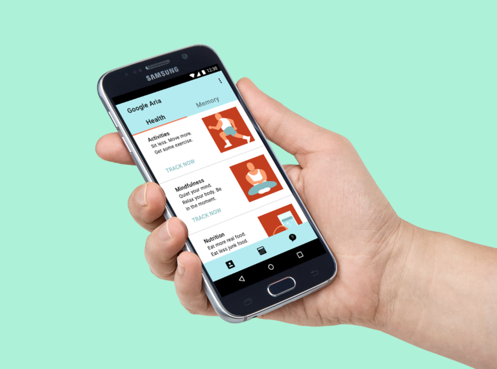
Google Aria is a wearable technology and accompanying mobile app that, combined, allows users to track their vitals and organize and store other personal data. The wearable comes in the shape of a necklace that, for more accuracy, can also be worn as a chest patch.

The Context & Problem
Due to the delicate nature of the condition, it was challenging to find people to talk to in regards to their personal memory loss experiences. The subject who agreed to discuss their experience was still independently functioning and able to recall their past. Caretakers also contributed to the research by sharing their experiences. It was also important to consider that elderly populations already have limited and/or amateur experience with technology, and this might be compounded by cognitive problems.
Research and Discovery
Getting to know the problem: Research
For the discovery phase, I concentrated the bulk of my research on uncovering qualitative data in the form of user interviews. I supplemented these findings with secondary research on websites that focuses on Alzheimer's disease and dementia, and discussion websites such as reddit.
Research Goals
Gain empathy and insight into patient's experience: the frustrations, pain points, and motivations that exist throughout their day-to-day.
Better understand the patient and caregiver relationship (tools used, job responsibilities and expectations, legalities, daily activities)
Appreciate the complex web of relationships at play from an interpersonal level to a systemic level
Process
• Target User Interviews (5-6 participants based on provisional personas)
• Secondary Research into websites and articles that focuses on signs and symptoms of memory loss, and methods on how to facilitate memory so patients can lead a more fulfilling life.

Key Insights
Most of interview participants were caretakers or family members, and only one participant with first hand experience. From these conversations I was able to gain a clearer picture of the patient's feelings and needs. The core insight gained from this discovery phase was that the users want to maintain control of their lives, but because of the nature of their condition, they need to rely on others for assistance sometimes. Being aware of this dependency, patients tend to keep to themselves for fear of being a burden to their family and friends. Based on these insights, I decided to focus on designing the app as solution to improving the patient/caretaker relationship.

Synthesis & Defining the Problem
I synthesized my research findings into empathy maps and personas. In this case study, I found that there are two types of personas that are affected by memory loss, the patient and the caregiver/family member. Both persona's ultimate goal is focused on the well-being of the primary user.
Primary Persona
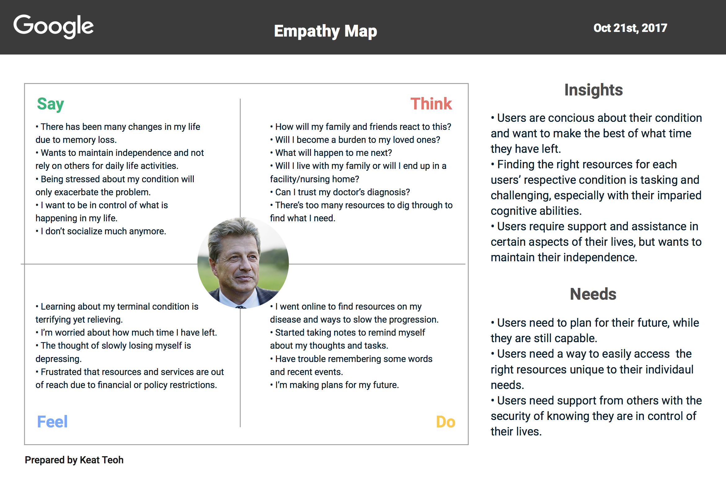

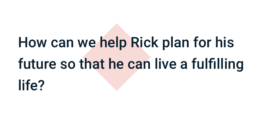
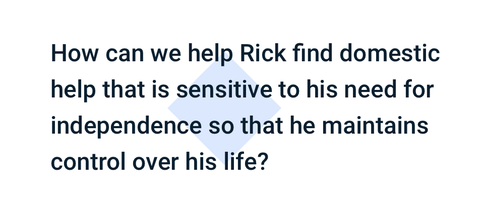
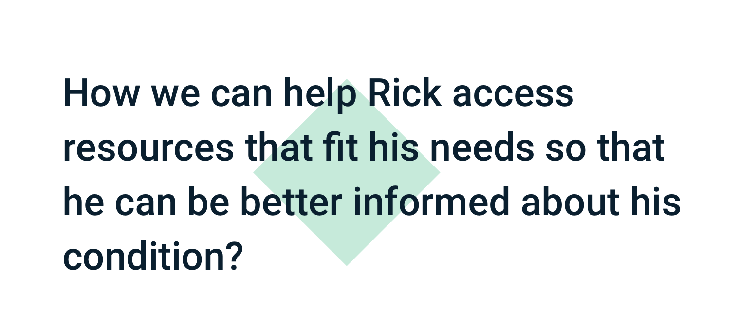
Rick, the primary persona, has the early stages of vascular dementia. He still lives independently, and is in control of his daily life activities. However, he is aware of the gradual progression of the disease and wants to do whatever he can to slow the progression.
Secondary Persona


Anna, the secondary persona that will also be accessing the mobile app, is the primary persona's daughter and will act as his proxy. She has a job and her own family to take care of, but wants to do what she can to help her father. She understands that Rick wants to be able to take care of himself without her help, and wants a way to meet him in the middle and not have to worry about his well being at all times.
Designing for the Primary (With the Secondary in mind)
While two personas were identified, I chose Rick as the focus of my design solution because his needs are more immediate and he will be the user of the wearable technology.
Whereas Anna's main usage for the app is to keep track of Rick's status, and she can also use the app to keep track of her own health and lifestyle.
I believe that designing the app with the focus on the user's need of connecting with others and finding assistance when in need can positively impact the patient and caregiver dynamic.
Reframing the Problem
To guide my brainstorming and feature prioritization, I reframed each personas' goals and needs through their point of view, in order to define a set of prioritized features posed as How Might We questions, which allows me to break down the problem space and ideate solutions for each problem.
Brainstorming
Using the How Might Questions as a jump off point, I brainstormed various solutions for each problem space, with both the primary and secondary personas in mind. This helps further define the mobile app's usability for the user, and determine what keys features are crucial to helping the user become successful in their goals.
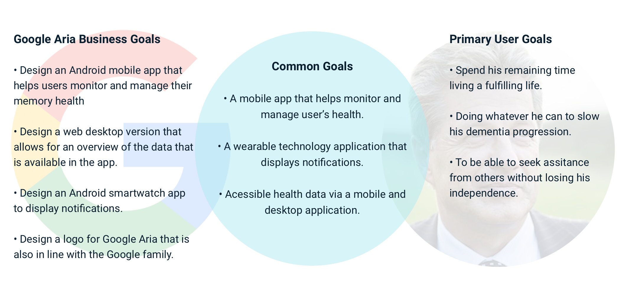
Strategizing the Solution
With various solutions at hand, I created a Business and User Goal document to find their Common goals, and also a Product Roadmap chart to prioritize what feature to focus on and build first.

Solving the Problem
Understanding that the application's user interface is key to ideating the solution. By mapping out the structure of the app and how the user will interact with it, I could further define the solution.

Application Map
I designed a structure for the mobile app via a sitemap diagram, which will provide an overview of how the features are laid out, and how the user will navigate to access them.
User Flow
Once the structure of the site is defined with a sitemap, I charted how users would land onto and navigate the site. This helps determine what the user interface requirements are, in order for the user to be successful in their task, which in this case:
1. To go through the on-boarding process and create or connect an account.
2. To connect the user's account with a proxy, which is the secondary persona Anna's account.
3. To set a reminder to pickup prescriptions with the mobile app's calendar feature.

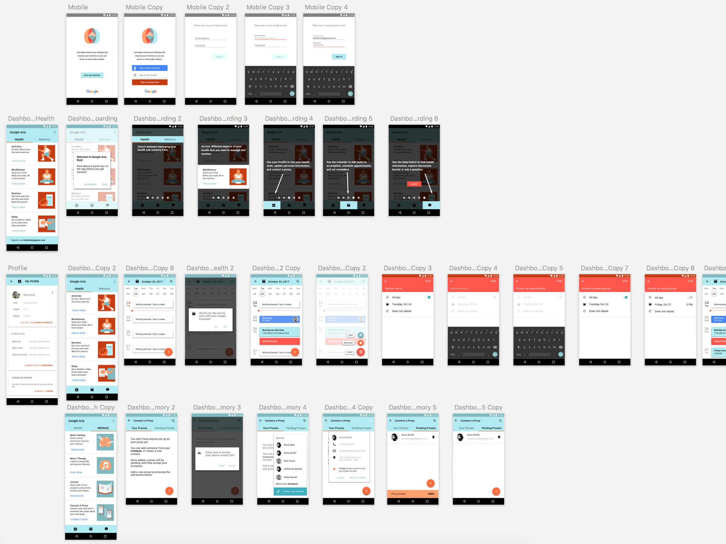
Interaction Design: Paper to Prototype
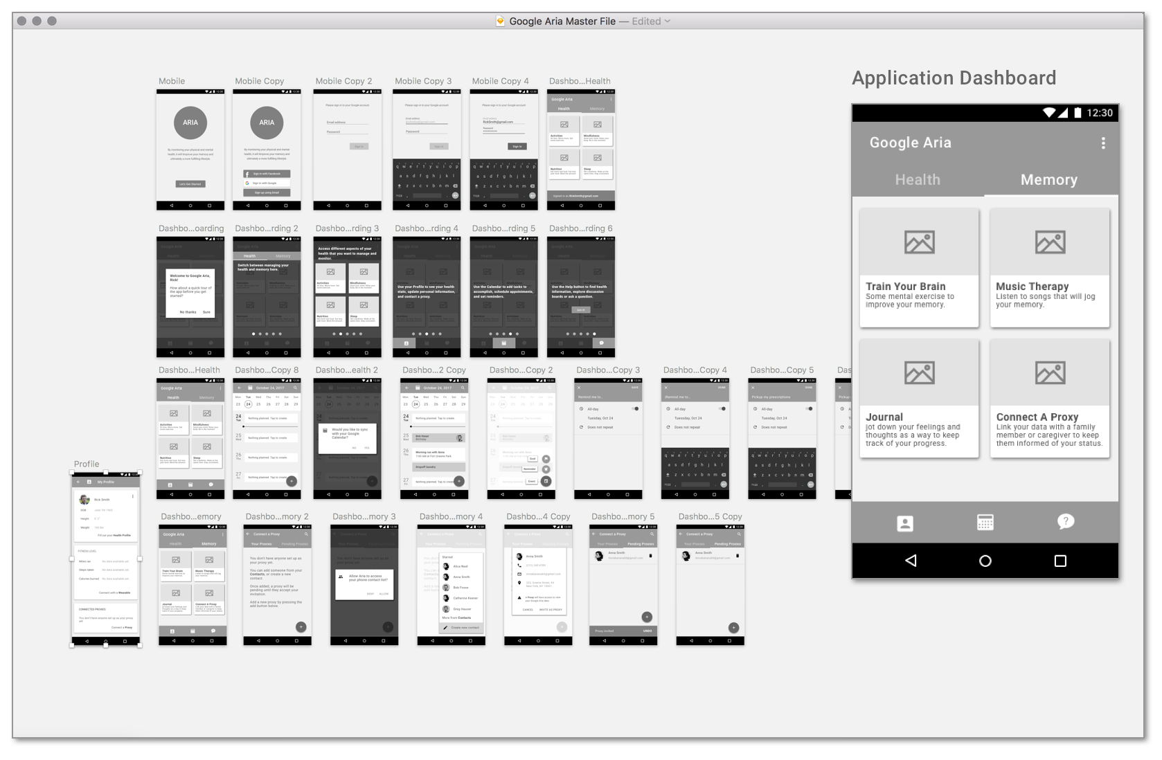
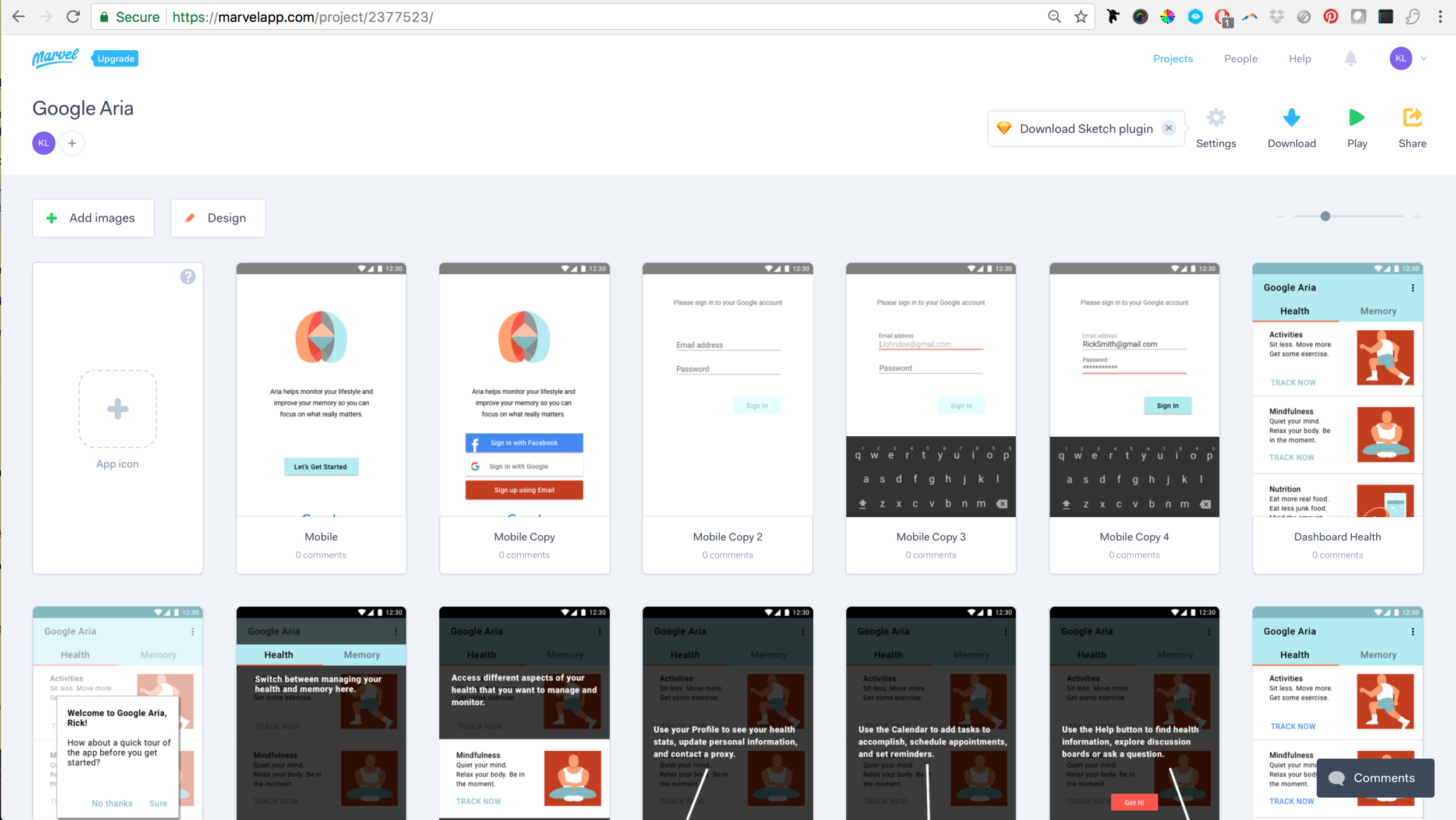
I selected key screens integral to the user tasks and started with low fidelity sketches of the following: the splash screen, login and tutorial guide, the dashboard, proxy connection and the calendar. Once I was satisfied with the rough draft of the flow chart, I created greyscale wireframes for building the prototype, and put them together in Marvel app.

Design Validation: Usability Testing
Test Goals
Once a working prototype was built, I took my mobile prototype out for some testing with the following test goals:
To determine the effectiveness of user flow for on-boarding and navigating the mobile application.
Performing tasks of creating a reminder and also connecting a proxy to the user’s account.
Determine whether layout and flow of the application causes the user any friction.

Using iOS 11's new screen recording feature, I managed to record both screen interactions and conversation audio.
Results
To gain some insight into what steps to take next to improve the mobile app experience, I analyzed the test findings by taking notes on the successes of the user tasks, user navigation patterns and behaviors, and also any feedback provided by the test participants. I was also surprised by the frequent user behavior of going for the profile screen first.

Visual Design
Being a Google product, the app's visual design had to be inline with Google's Material Design guidelines. Having a visual guideline does not come without its own challenges, such as creating a logo that visually represents the Google family brand, and deciding on a color palette that is relevant to the product and its user, while still meeting the guideline requirements.
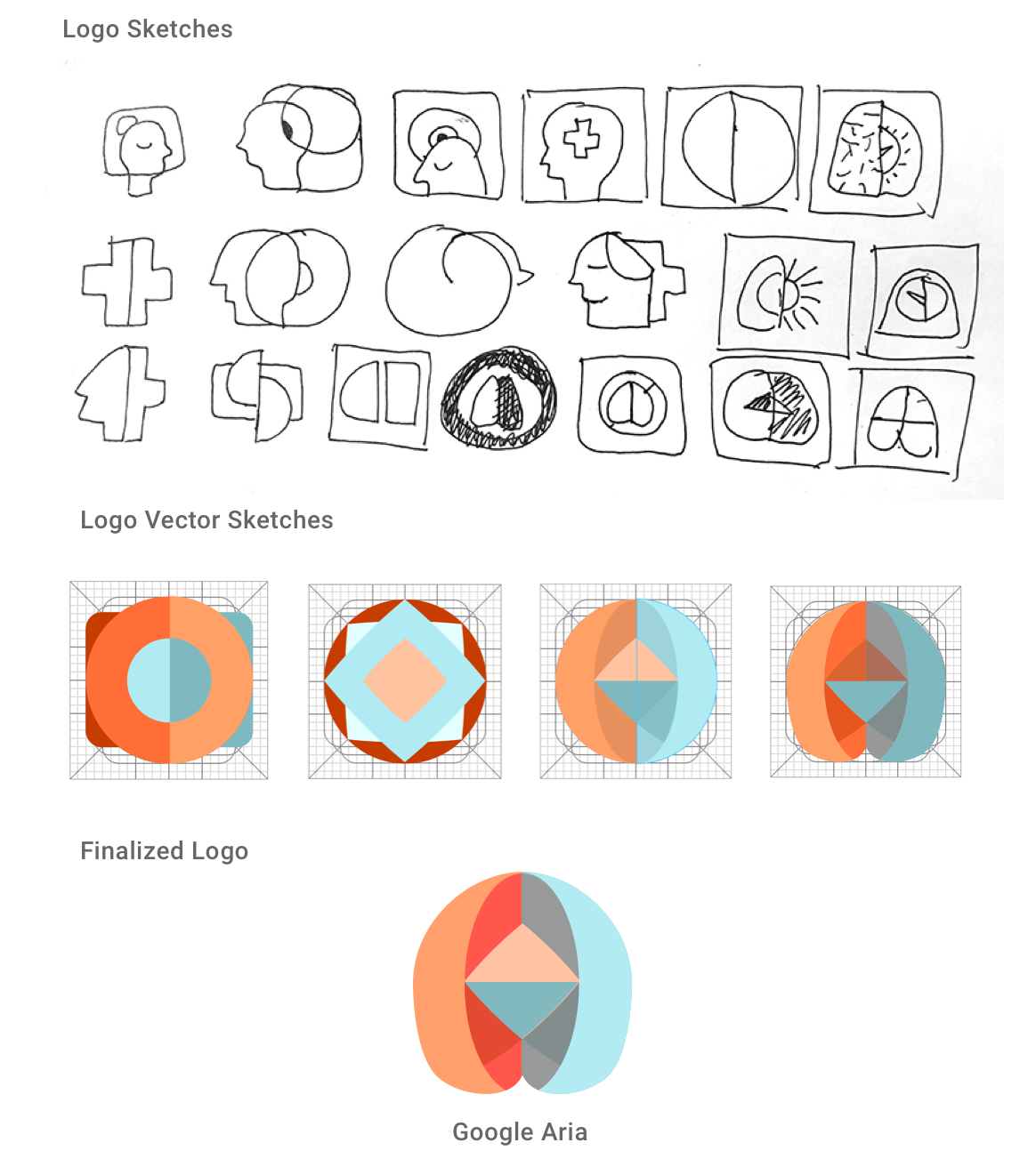
Logo Design
With the mobile app's features in mind, along with a moodboard and adjectives to describe the brand, I set out to design a logo for Google Aria that would convey its usage with only shapes and colors.

Style Tile
Once I had a finalized logo, compiling the Style Tile document for the app's UI design was pretty straightforward. Being that typography was already pre-determined by Material Design guidelines, the design challenges were in the determining the color palette. I immersed myself into other Google products, and learned that the apps needed some accent colors that echoed the original Google logo colors.

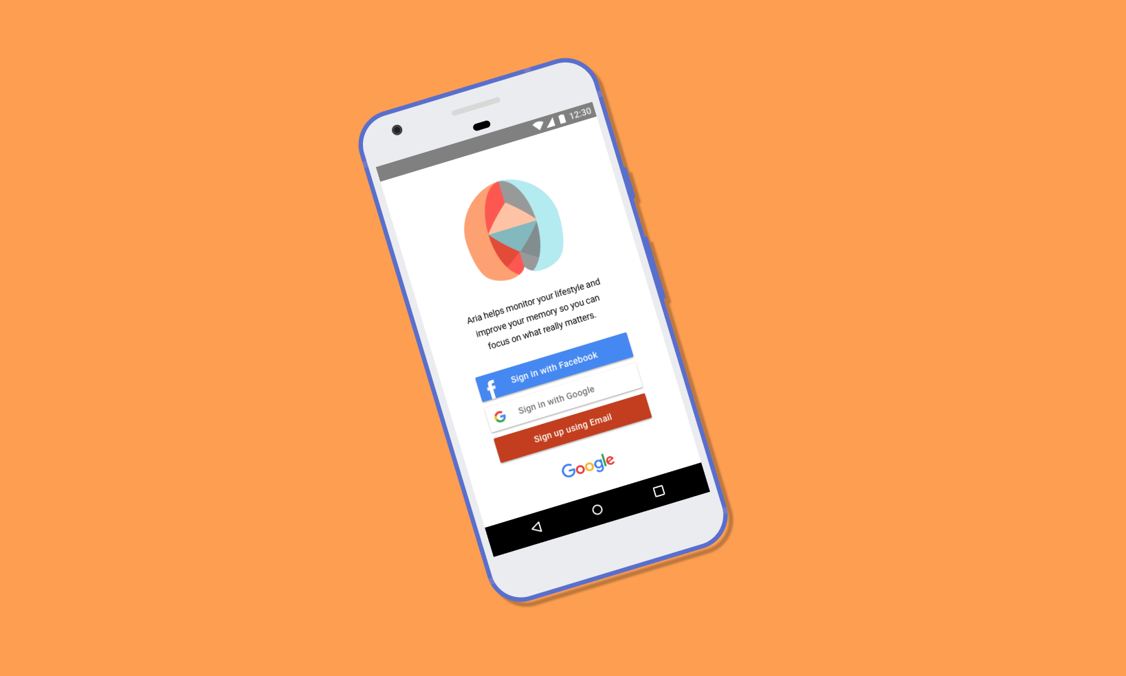
Finalized High Fidelity Frames
By referencing the Style tile document, Google's Material Design guidelines, and the Next Steps from the Affinity Map, I updated the mid-fidelity wireframe UI, as well as revising the UI based on usability test findings. The goal of creating a hi-fi prototype is to present the prototype to developers and stakeholders to showcase how the mobile app should work.
Takeaways & Considerations
From this case study, I learned a great deal about dementia and how it affects the lives of a patient and everyone around them. The main takeaway from my experience designing the mobile app is that it should be a tool that serves as a conduit between patient and caregiver.
Next (possible) steps for Google Aria
• Research what type of games or puzzle best stimulates the brain, and how to incorporate music therapy into the app.
• Design a desktop dashboard that allows for an overview of the data that is available in the app.
• Design a smartwatch app (Android) to display notifications from the wearable and mobile app.
• Explore how the social feature of the app can connect the user to the right resources easily.