
Boston.gov
Boston.gov's Certificate Request Service
Research & Discovery | Synthesis & Defining | Interaction Design | Testing | Project Handoff
Overview
The focus of this case study for Designlab is designing a fully online feature to handle citizen certificates requests (birth, marriage and death). Due to logistics at the time of this study, I was living in NYC, and being a similar metropolitan city, the research is based on NYC’s local government services.
In 2016, IDEO worked with the city of Boston to update the city's government website, as a first step to slowly integrate city services into the online space to better serve the city's population. From that project, a brand guide was developed, so that future designers and collaborators had a reference to work from.
With a pre-defined brand guide, I was able to focus on the user experience and interaction design, and apply the stylings according to the guide to ensure a consistent user experience throughout the website.
Design Goals
• Design the logged in responsive environment for Boston.gov to view and apply for services online.
• Design the process to request a birth, marriage and death certificate fully online
• Add access to other additional top services.
Project Details
Challenge: To add a 'logged in environment' feature to Boston.gov's existing site and also a fully online service to request certificates, while maintaining a UI design that is in line with Boston.gov's brand guidelines.
Client: Boston.gov
Role: Lead Designer: Design Researcher, IxDesigner, Visual Designer
Duration | 2 weeks

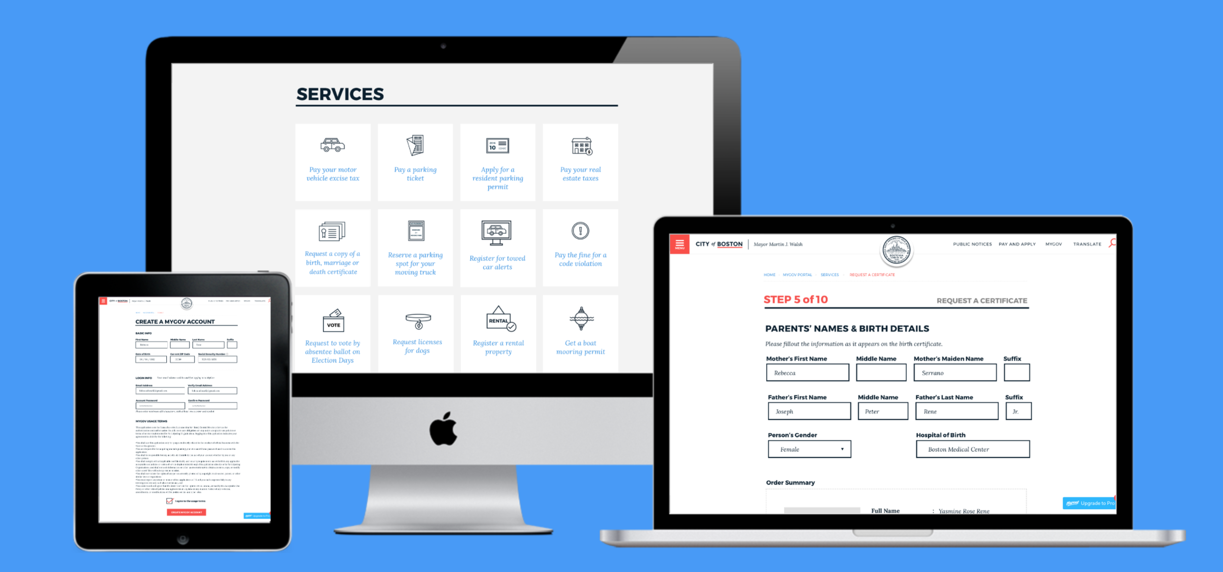
The added feature of requesting for a birth certificate can be tested on this prototype.
Research and Discovery
Getting to know the problem
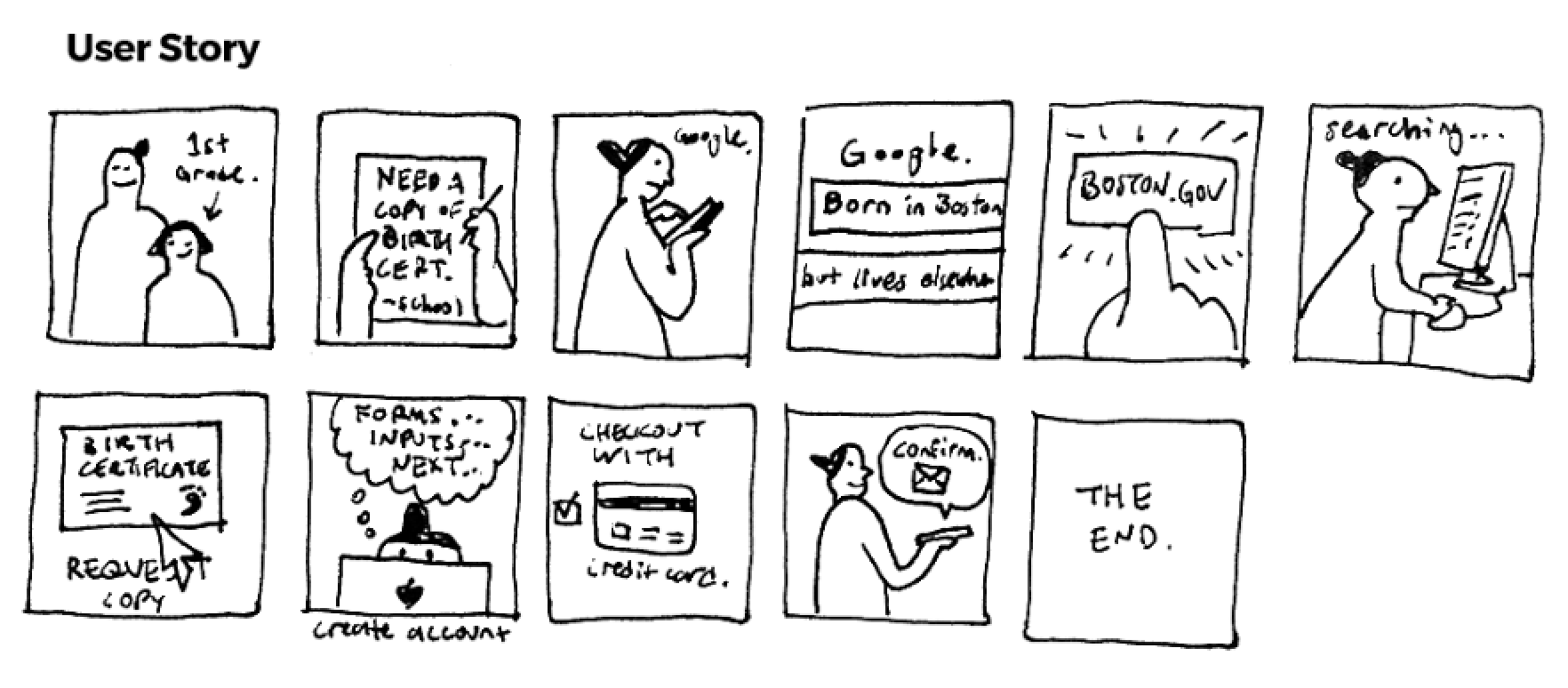
Boston.gov's new feature request: A logged in environment and a fully online service to request a birth, marriage or death certificate are totally new features to the client. Studying an existing system might prove to be useful, which led me to my local registry in downtown New York City (which offers an online service) and conduct some research on user experiences with the request process.
Research Goals
• Conduct a discovery phase to learn about the user experience of requesting a certificate with the existing system.
• Define the main pain points for users when using the service, both online and offline.
• What are the base features required to build a fully online service?
Process
Through a mix of research techniques and guided by some secondary research of Boston.gov's current service, I dived into the subject by immersing myself within the actual process of getting my own birth certificate (spoiler alert: Took about 40 mins) and spent an entire day at New York City's Department of Health & Mental Hygiene, conducting some interviews with customers using the certificate request service.

Key Insights
From this research, I discovered the currently working albeit flawed system of requesting a birth certificate online. The existing online service that New York City has to offer is merely a third party request service called Vitalchek which charges a fee in addition to the certificate and shipping costs. Although slightly better than Boston's non-existing online service, users were not succeeding in their tasks which ultimately led them to request the certificates in person. A key observation I picked up was that NYC's online service is outsourced to a third party site, which breaks the user's task flow, and creates a friction that makes the user untrustworthy of the service. The lack of a logged in environment also dissuades the user from using the online service because they have no way of knowing the status of their request post-checkout. Boston.gov can take this opportunity to start from scratch and design a request service that can tackle these problematic insights.

Synthesis & Defining the Problem
Through my research, I synthesized my findings using an empathy map and storyboards, to create a primary persona which defines the average user's needs and goals. This persona will be used to validate the design decisions for the solution.


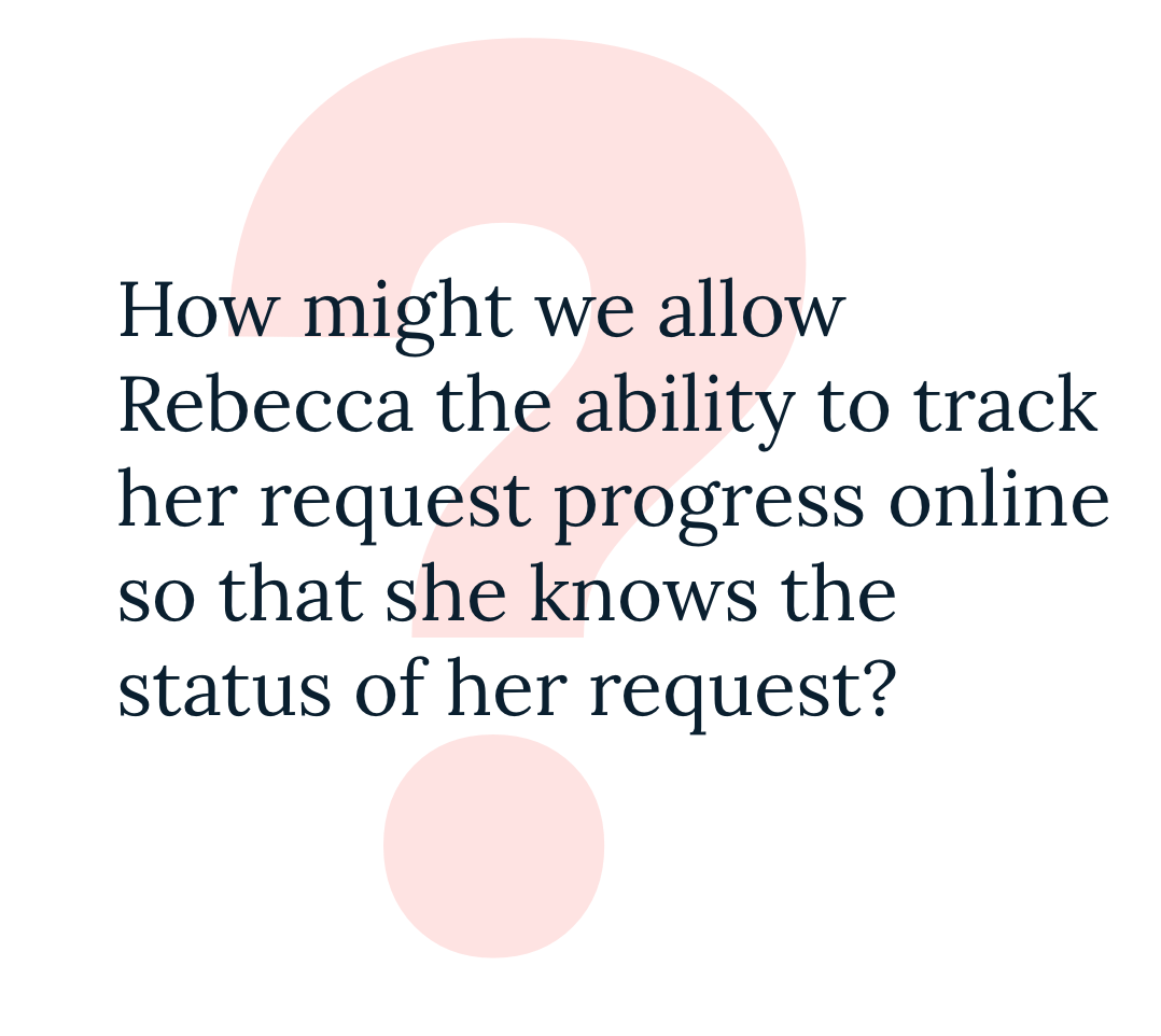
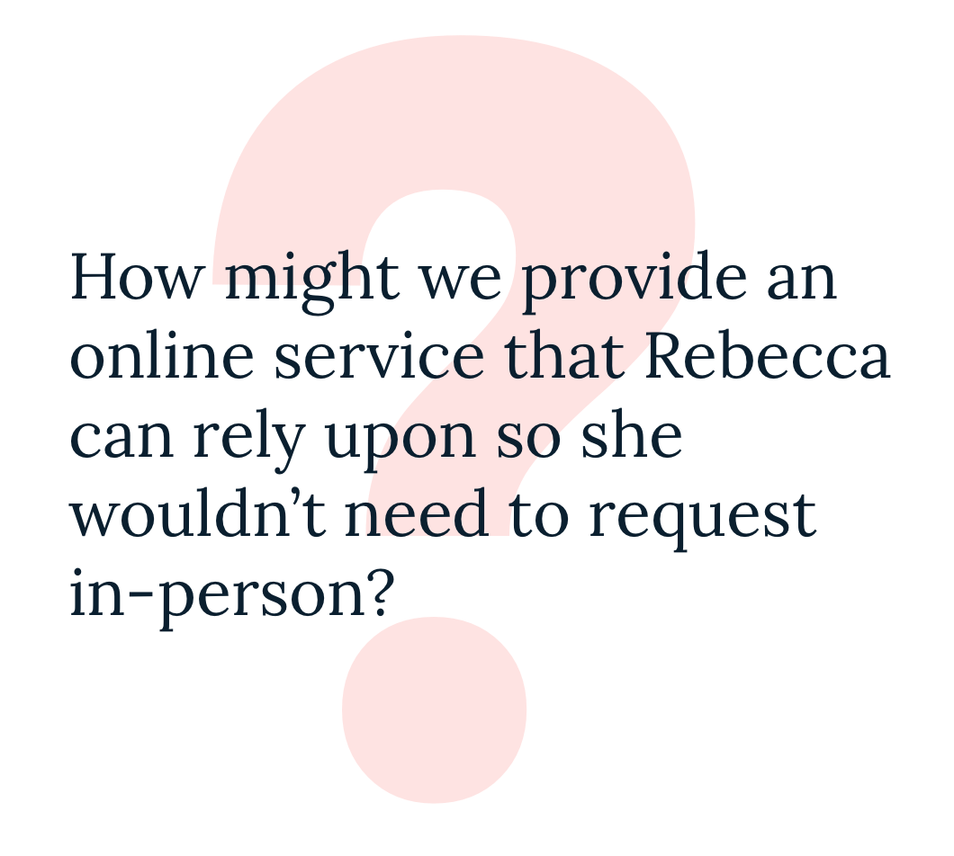
Reframing the Problem
To guide my ideation, I reframed the persona's needs and goals as 'How Might We...?" questions to define the prioritized features.
Brainstorming
Using the How Might We Questions as a jump off point, I brainstormed various solutions for each problem. This exercise validates and aligns with Boston.Gov proposed feature of a logged in environment, as well as a need for the online request service to be reliable and easy to use.
Feature Prioritization
By outlining the business and user goals, I was able to find commonality of both party's goals, and charted a product roadmap to each solution's priority and listed features for each solution.

Solving the Problem
Knowing that the proposed solution will have to be in line with Boston.Gov's brand guidelines, I conducted a site audit before laying out sitemaps for both the main portion of the website and the logged in environment. A user flow diagram is also created to determine how the user will navigate and find the new feature within the website.
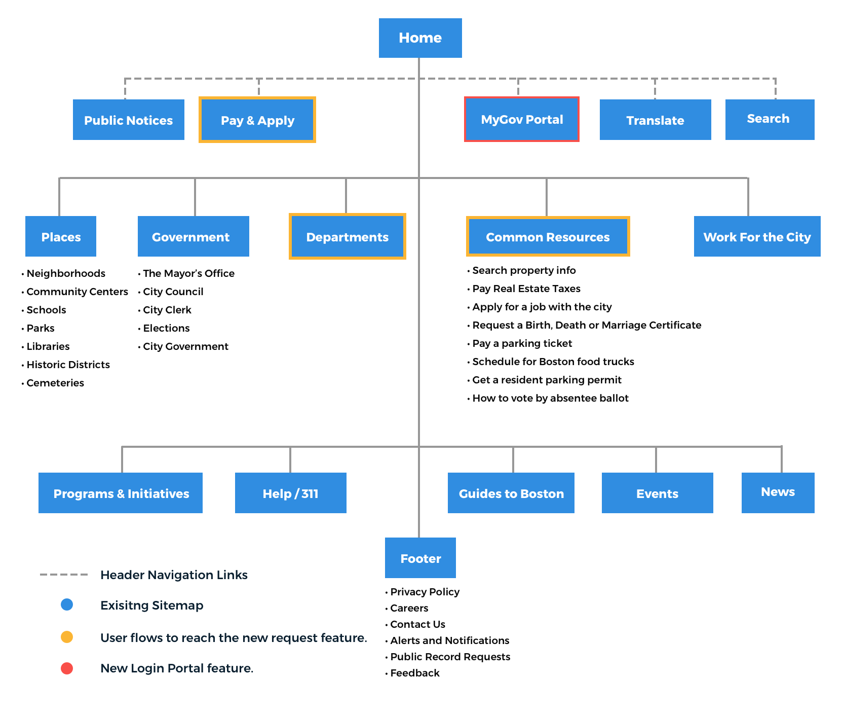
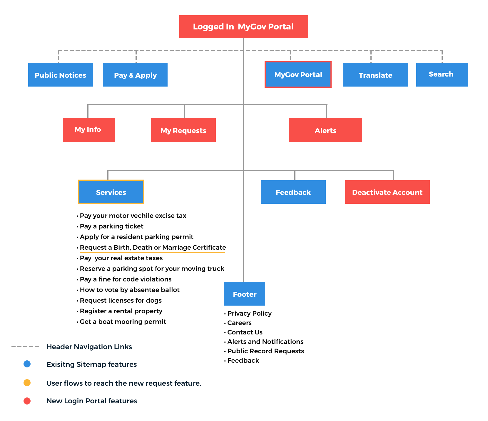
Sitemapping
Two sitemaps were created, one of the Boston.Gov's current sitemap and how the proposed feature would fit into the site structure, and the second a sitemap of the logged in environment, to define how the user will be able to access the certificate request service. It is important that users who are new to the website will be able to navigate themselves and find the service they are seeking, and in this case, to request a birth certificate. I've also decided to label the logged in environment as MyGov Portal, which can be accessed on the top header navigation, similar to a login / profile button.

User Flow
Once the structure of the site is defined with a sitemap, I charted how users would land onto and navigate the site. This helps determine what the user interface requirements are, in order for the user to be successful in their task: creating a user account for the logged in environment and requesting a birth certificate via the online request service.
Interaction Design: From Low to High Fidelity
Since Boston.Gov had a existing user interface and style tile I could reference, I decided to dive straight into creating high fidelity wireframes for the prototype. The goal of doing so is to make the experience as consistent and seamless as it would if on the actual website, and with Boston.Gov brand guidelines already nicely laid out for me, it wasn't too hard to design the UI for the proposed new features.
Site Audits
I combed through Boston.Gov's existing site and gathered design patterns and UI elements that I thought would be relevant to building the logged in environment and the online request service. I also audited Vitalchek's request service to glean some insight from the user flow.
Sketching
When building anything, it's best to have a blueprint before getting started. Just because most of the design elements and styling had been determined, I still had to design the request service's interactions and system architecture. Using data gathered from my immersion research and Vitalchek.com's site audit, I designed a rough sketch of how the user would interact with the interface: from landing on the home page, to creating an account to access the logged in environment service, to filling out an application to request a birth certificate.
Hi Fidelity Wireframes and Annotations
Even though I was provided with a guideline of how the UI should look, designing how the process should work was still a challenge, especially for a governmental service, where there's a consideration of accessibility and minimizing margin for error. The process for requesting a certificates consists of several steps which didn't require any annotations since the design patterns were based on tried and true form inputs.


Prototyping
I imported the hi fidelity wireframes into the Marvel app and then linked all the pages to frame the task flow that will be tested: to request a birth certificate from Boston.gov's new fully online service, and also create an account for the logged in environment. With the prototype, I can test the usability of the proposed new features and document any findings or pain points.

Design Validation: Usability Testing
Test Goals
Once a working prototype was built using Marvel app, I took my prototype out for some testing with the following test goals:
• To determine the effectiveness of user flow for requesting a birth certificate
• A secondary task of creating an account to access the logged in environment, where the user can use the certificate request service
• Determine whether layout and flow of the new features causes the user any friction
I found eight participants to test the prototypes, where I observed their interaction, while recording both screen and audio for further analysis.

Results
I analyzed the test findings by taking notes on the successes and failures when completing the user task, user navigation patterns and behaviors, and also any feedback provided by the test participants. This allowed me to gain some insight into what steps to take next to improve the user experience.
Based on the findings from the affinity map, I revised the prototype with the outlined improvements.

Project Handoff
With the working prototype finalized, a UI Kit is created as a guiding document to be shared, along with the prototype, with stakeholders and developers.
Final Takeaways
Based on initial feedback and findings, users were impressed with the ease of use for a government online service. There were concerns with the task flow having too many steps and fine print to read through, which is a necessary design tradeoff. I've managed to cutdown the process to 10 steps (compared to Vitalchek's 15 steps) which helps break down the task into smaller info chunks, which improves user's focus and minimize margin for user error.
...and Some Potential Features to explore in further iterations
Ability to apply for permits
Request to vote by absentee ballot on Election Days
File a claim with the city
Register a Business
Register a rental property
Register for towed car alerts